javascript30 - 05 - Flex Panel Gallery
초기화면
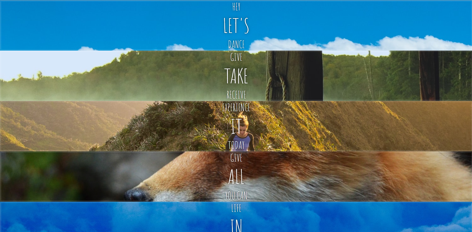
화면 배치후
css 부분
html {
  box-sizing: border-box;
  background: #ffc600;
  font-family: "helvetica neue";
  font-size: 20px;
  font-weight: 200;
}

body {
  margin: 0;
}
/*     CSS에서, ::before는 선택한 요소의 첫 자식으로 의사 요소를 하나 생성합니다 */
*,
*:before,
*:after {
  /* 	박스의 크기를 어떤 것을 기준으로 계산할지 : 부모 요소의 속성값을 상속받습니다. */
  box-sizing: inherit;
}

.panels {
  min-height: 100vh;
  overflow: hidden;
  display: flex;
}

.panel {
  background: #6b0f9c;
  box-shadow: inset 0 0 0 5px rgba(255, 255, 255, 0.1);
  color: white;
  text-align: center;
  align-items: center;
  /* Safari transitionend event.propertyName === flex */
  /* Chrome + FF transitionend event.propertyName === flex-grow */
  transition: font-size 0.7s cubic-bezier(0.61, -0.19, 0.7, -0.11), flex 0.7s
      cubic-bezier(0.61, -0.19, 0.7, -0.11), background 0.2s;
  font-size: 20px;
  background-size: cover;
  background-position: center;

  /* 	추가 */
  display: flex;
  flex-direction: column;
  justify-content: center;
  flex: 1;
}

.panel1 {
  background-image: url(https://source.unsplash.com/gYl-UtwNg_I/1500x1500);
}
.panel2 {
  background-image: url(https://source.unsplash.com/rFKUFzjPYiQ/1500x1500);
}
.panel3 {
  background-image: url(https://images.unsplash.com/photo-1465188162913-8fb5709d6d57?ixlib=rb-0.3.5&q=80&fm=jpg&crop=faces&cs=tinysrgb&w=1500&h=1500&fit=crop&s=967e8a713a4e395260793fc8c802901d);
}
.panel4 {
  background-image: url(https://source.unsplash.com/ITjiVXcwVng/1500x1500);
}
.panel5 {
  background-image: url(https://source.unsplash.com/3MNzGlQM7qs/1500x1500);
}

/* Flex Children */
/* panel 클래스 바로 하위의 모든 element에 적용 */
.panel > * {
  margin: 0;
  width: 100%;
  transition: transform 0.5s;

  /* 	추가 : 늘어나게 flex-grow를 1로 설정 + 가운데 정렬*/
  flex: 1 0 auto;
  display: flex;
  justify-content: center;
  align-items: center;
}
/* translateY(-100%); 등을 이용하여 화면에서 나가게 만든다 */
.panel > *:first-child {
  transform: translateY(-100%);
}
.panel.open-active > *:first-child {
  transform: translateY(0);
}
.panel > *:last-child {
  transform: translateY(100%);
}
.panel.open-active > *:last-child {
  transform: translateY(0);
}

.panel p {
  text-transform: uppercase;
  font-family: "Amatic SC", cursive;
  text-shadow: 0 0 4px rgba(0, 0, 0, 0.72), 0 0 14px rgba(0, 0, 0, 0.45);
  font-size: 2em;
}

.panel p:nth-child(2) {
  font-size: 4em;
}

.panel.open {
  flex: 5;
  font-size: 40px;
}
@media only screen and (max-width: 600px) {
  .panel p {
    font-size: 1em;
  }
}
js 부분
const panels = document.querySelectorAll(".panel");

function toggleOpen() {
  // 	toggle : 클래스가 존재한다면 제거하고 false를 반환하며, 존재하지 않으면 클래스를 추가하고 true를 반환
  console.log("Hello");
  this.classList.toggle("open");
}
function toggleActive(e) {
  console.log(e.propertyName);
  if (e.propertyName.includes("flex")) {
    this.classList.toggle("open-active");
  }
}
panels.forEach((panel) => panel.addEventListener("click", toggleOpen));
panels.forEach((panel) =>
  panel.addEventListener("transitionend", toggleActive)
);
